Delivery_
Signage Design
Photo Direction
Design Execution
Year_
2023-2025
About_
Much of my work at Michael’s involved creating mock ups of the signs, with photo inspiration and instruction to the on-set Art Director. We would use the brand’s visual identity to create signs based on the size and location in the store. This ranged from large wall displays, hanging aisle banners, and free standing display inserts.
We worked closely with the copy team to ensure the messaging was right and the visual weight of the sign was balanced.
Design_
I always enjoyed picking the items from the collections to create visuals that created an impactful image to inspire the creativity of the customers. Though we would often be given photography by the vendors providing the product and so the challenge would become creating harmony between our aesthetic and theirs.
Delivery_
Visual Identity
App Design
Periodical Layouts
Year_
2017
About_
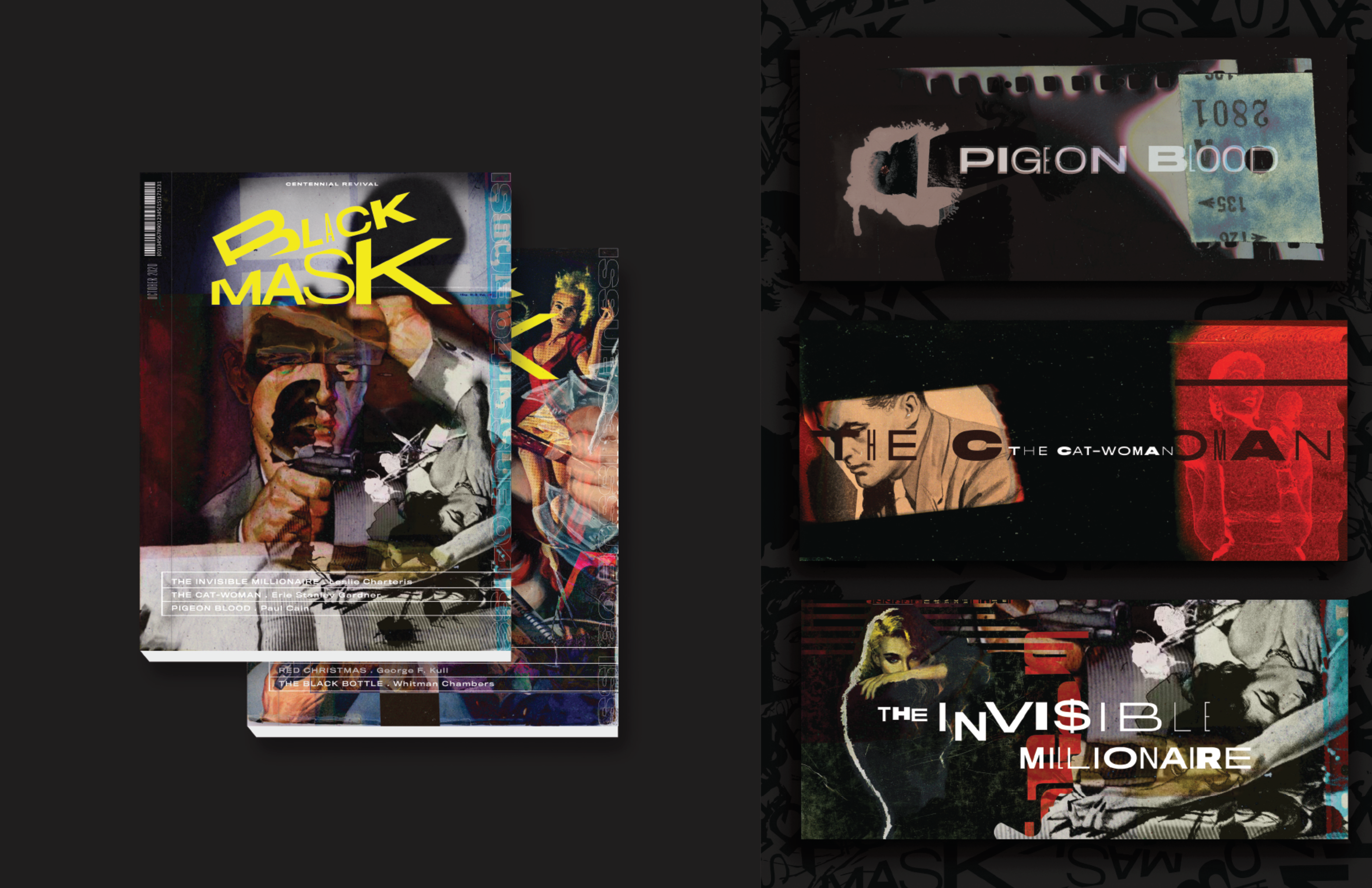
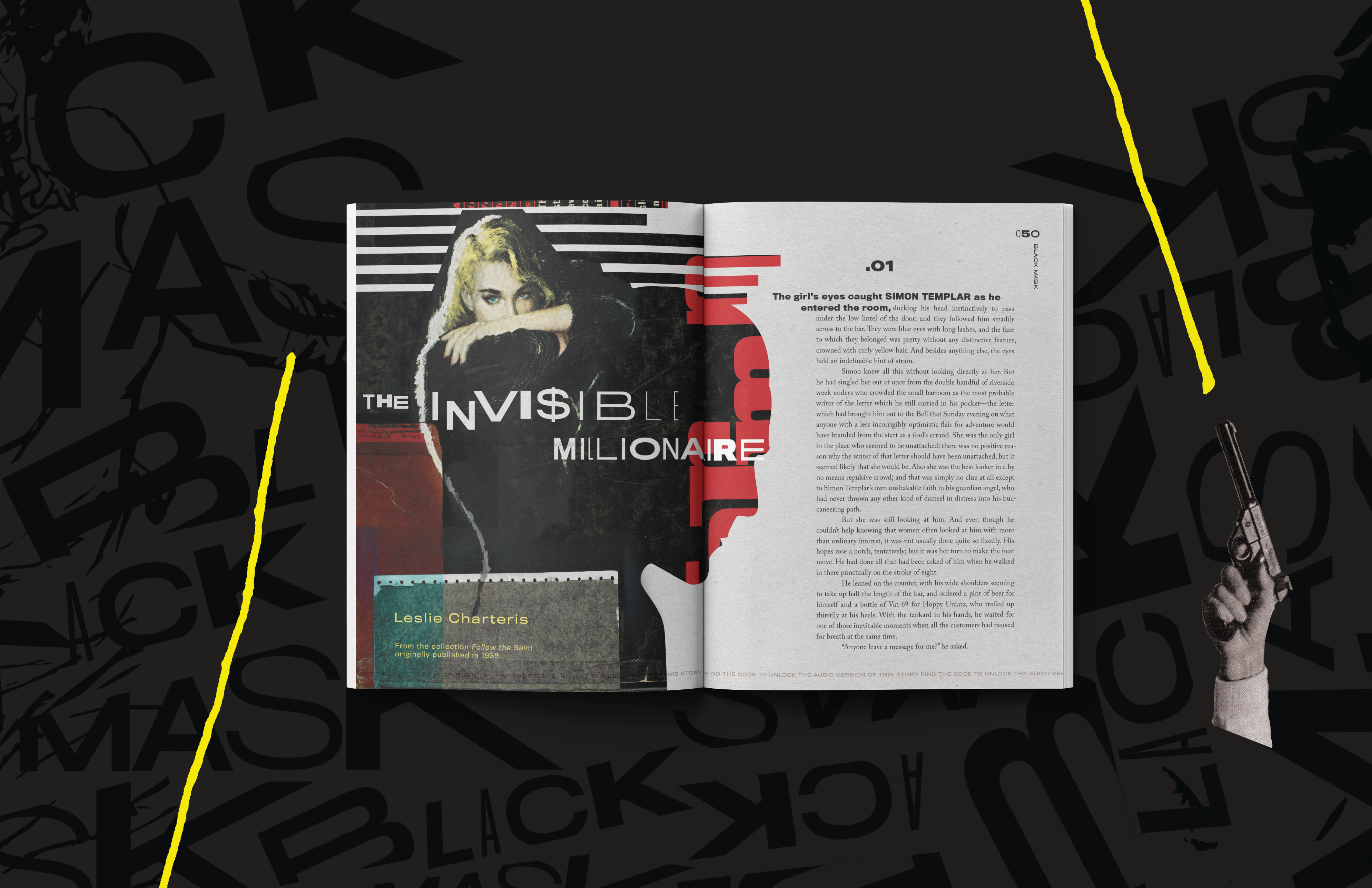
Inspired by the interactive gameplay of ARGs (Alternate Reality Games) and mystery in a box products, my idea was to revive the iconic Black Mask magazine. The return was meant to celebrate the 100 year anniversary of the pulp magazine known for publishing many mystery stories by authors that became the most well known in the genre.
Design_
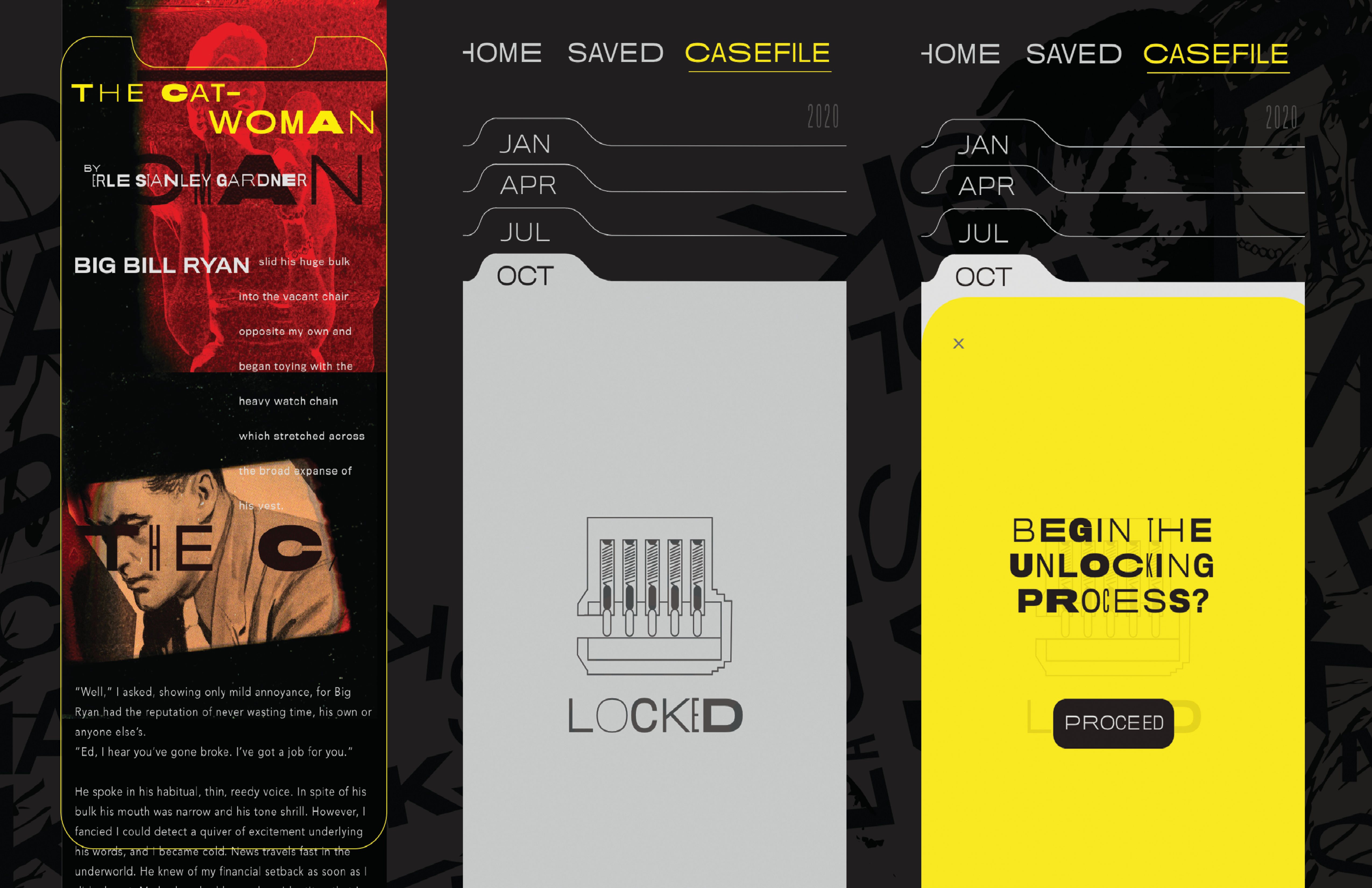
This new interpretation of the magazine would include clues and puzzles within the app that could be solved by engaging with the print magazine. The launch of a podcast as a companion to the magazine would include dramatic readings of choice stories and community participation in the on going mystery throughout the issues. New and old stories would be published along with tie in interviews with writers and filmmakers alike in the mystery genre at large.
Delivery_
Visual Identity
Website
Year_
2018
About_
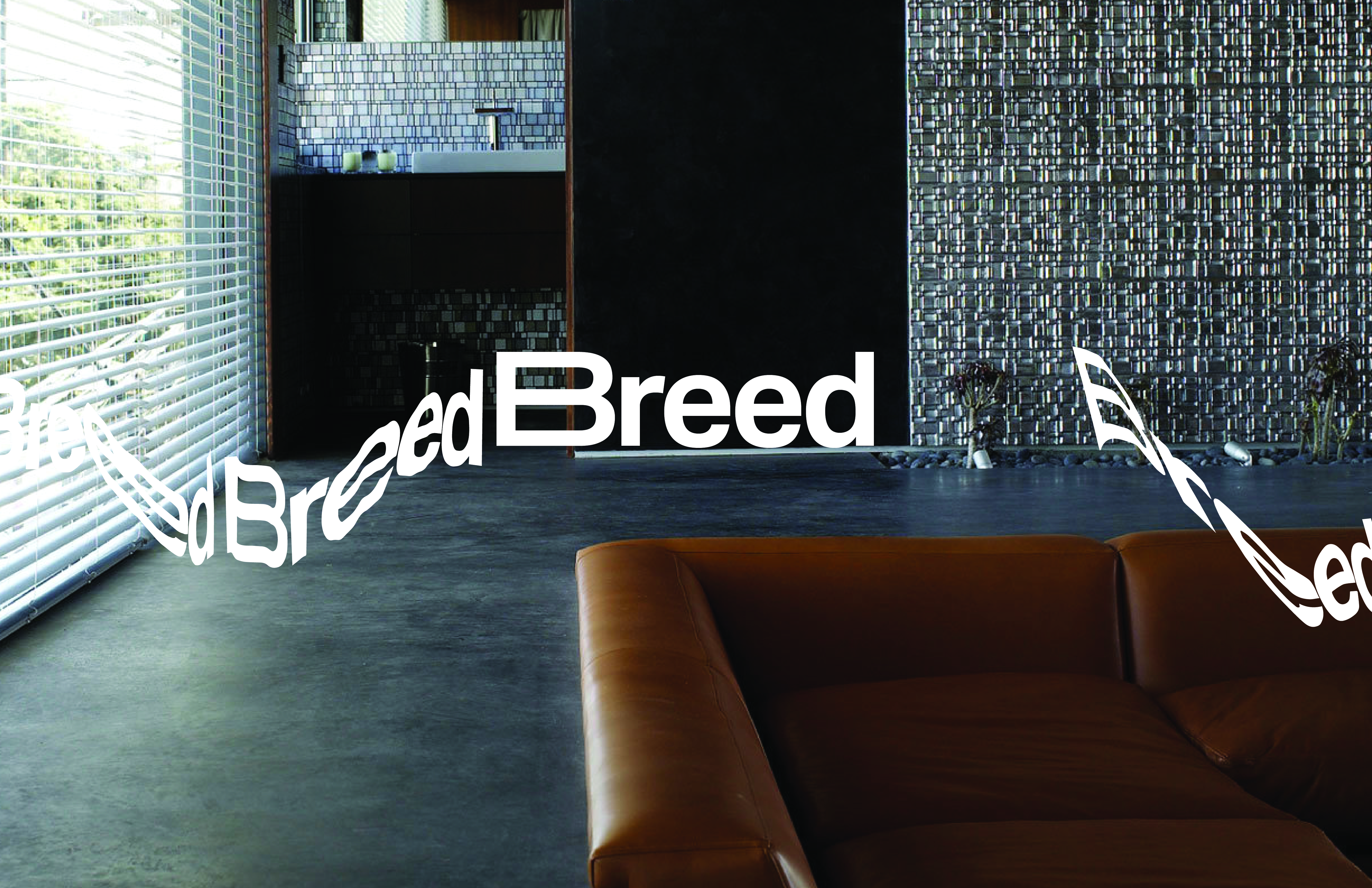
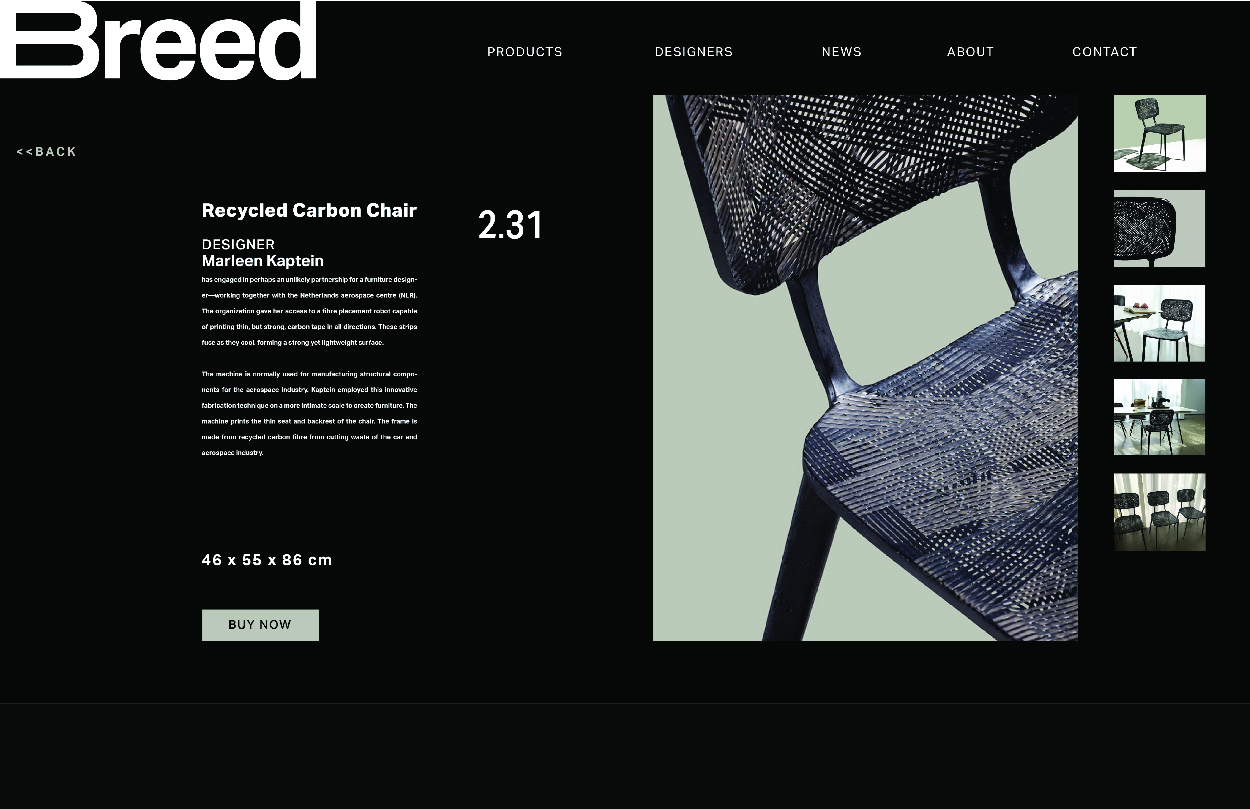
The Breed project is a redesign of the sustainable furniture startup LABEL/BREED. The Breed brand is focused on the development of sustainable and innovative interior objects by establishing collaborations between designers and manufacturers. The project was a student project aimed at redesigning a startup with little brand identity. The company is now presumed defunct.
Design_
My inspiration for the redesign was rooted in mid-century Scandinavian design principles. The company itself was based in Amsterdam and much of the furniture is clearly inspired by mid-century modern design. To give the company an avant-garde current twist I created a few alternative word marks with abstracted lettering. Much of the products utilize unusual or recycled materials so I sought to embed that design philosophy in the aesthetic of the brand.
Photography by Studio Aandacht
Delivery_
Visual Identity
Experience Design
Year_
2020
About_
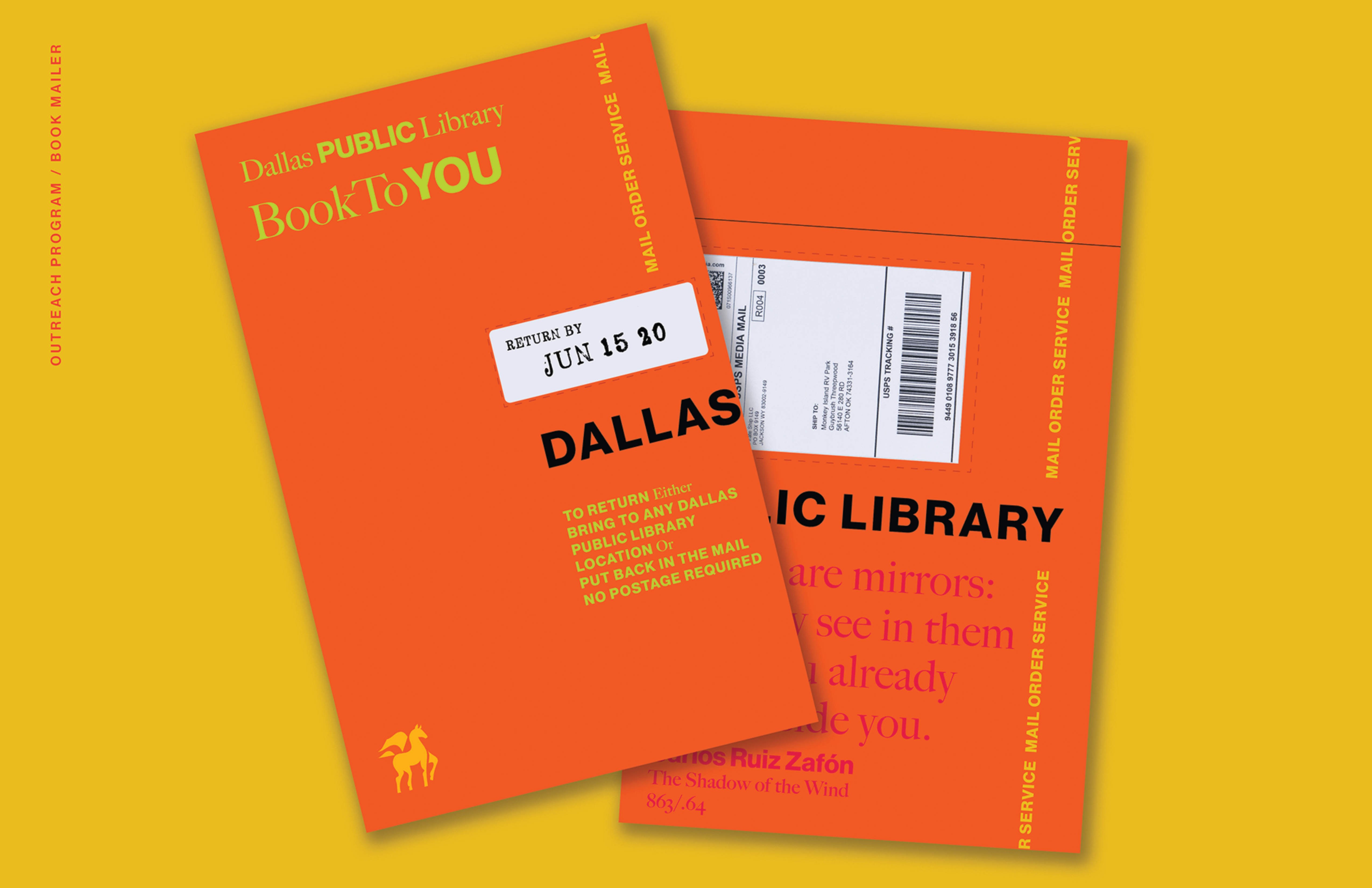
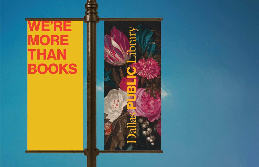
This redesign project was sparked by a desire to create a compelling and rich visual identity for all of the branches of the library, big and small. Much of the population of Dallas do not have convenient access to the services of the library system. I put much thought into potential outreach programs that could be expanded or implemented in new ways to reach the under served audiences all across Dallas.
Design_
A strong visual identity was designed for the instagram page to reach the teen and youth audiences to promote the programs already available and create new virtual programs to those without the physical ability to attend. An expanded mail in service by which patrons can request and return Library books with special envelopes that can be returned to any mailbox in the city. And to bring the Library to the people, I proposed small buses or vans to create a traveling library to create opportunities for the public to physically interact with the Library services and bring access to areas with limited access.
To create the visual texture of the variety of genres of books I looked to different paintings, photographs and textiles to represent them. Using these images as sort of wallpaper to represent the genre of the shelves is intended to create space for color and pattern in the potentially underfunded libraries. We want to spark imagination visually to inspire interest in the texts meant to represent them. Large type and an engaging mix of colors allow for the words themselves to speak apart from the images.
Delivery_
Experience Design
Interior Design
Visual Identity
Year_
2020
About_
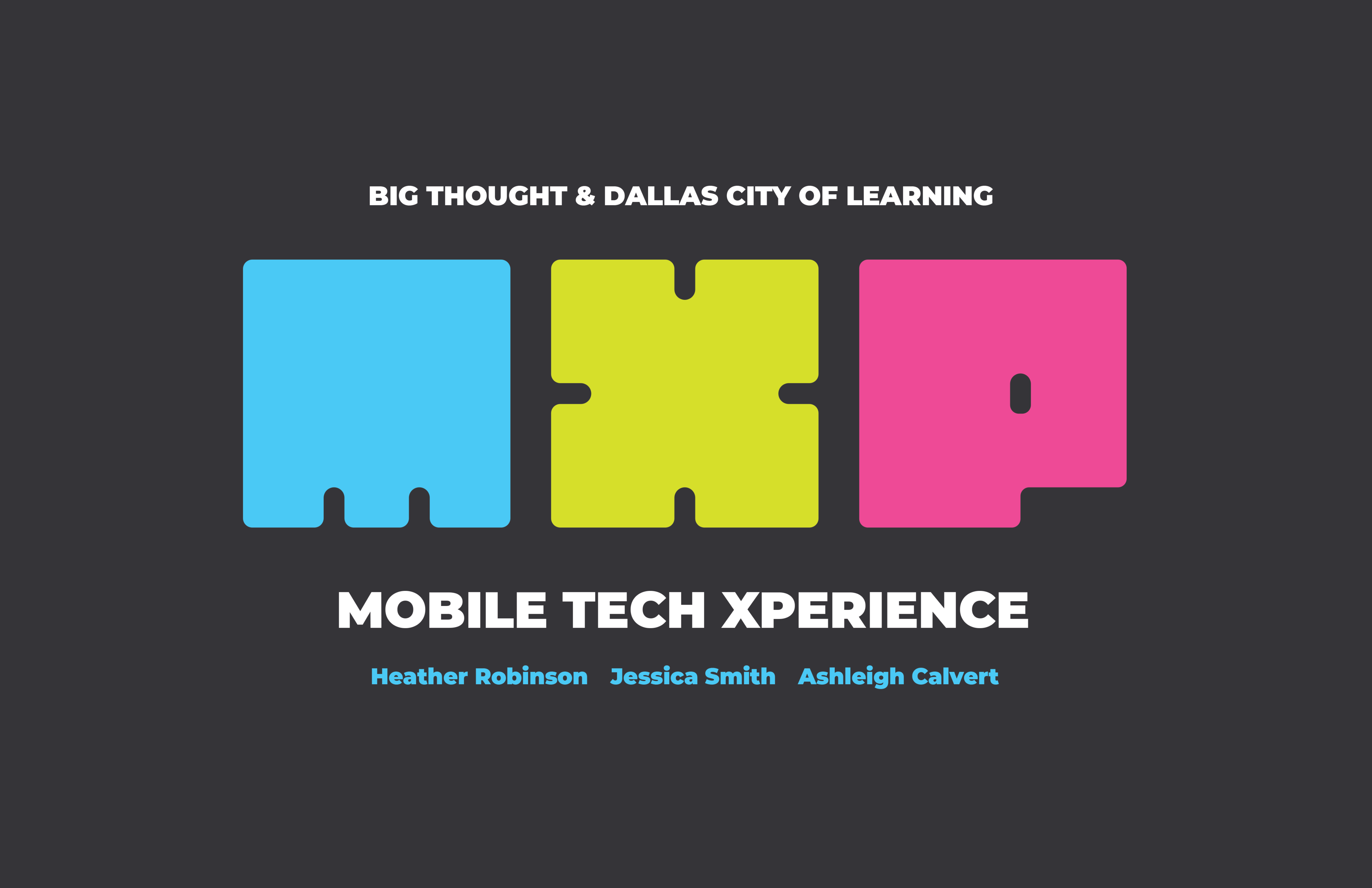
Big Thought approached our senior class with the opportunity to design a proposal for a rebrand for their MXP bus that brings fun STEM activities and demonstrations for schools all over Dallas. They focus on bringing under served communities access to engaging opportunities for kids to get excited about STEM fields and all they have to offer.
Design_
The company wanted ideas for how they could utilize their new bus with activities that could be accessed by multiple groups at a time without creating too much overlap. We devised three potential activities and a bus wrap to go on the exterior. A 3D printing space where kids can design and print their own acrylic letter, an inspiration wall where the finished students can display their creations on the light wall, the Battle Bots arena where groups learn to code their own robots to be controlled remotely, and the external tables that can provided covered work space for further information on the program.
Delivery_
Visual Identity
App Design
Collateral Design
Year_
2019
About_
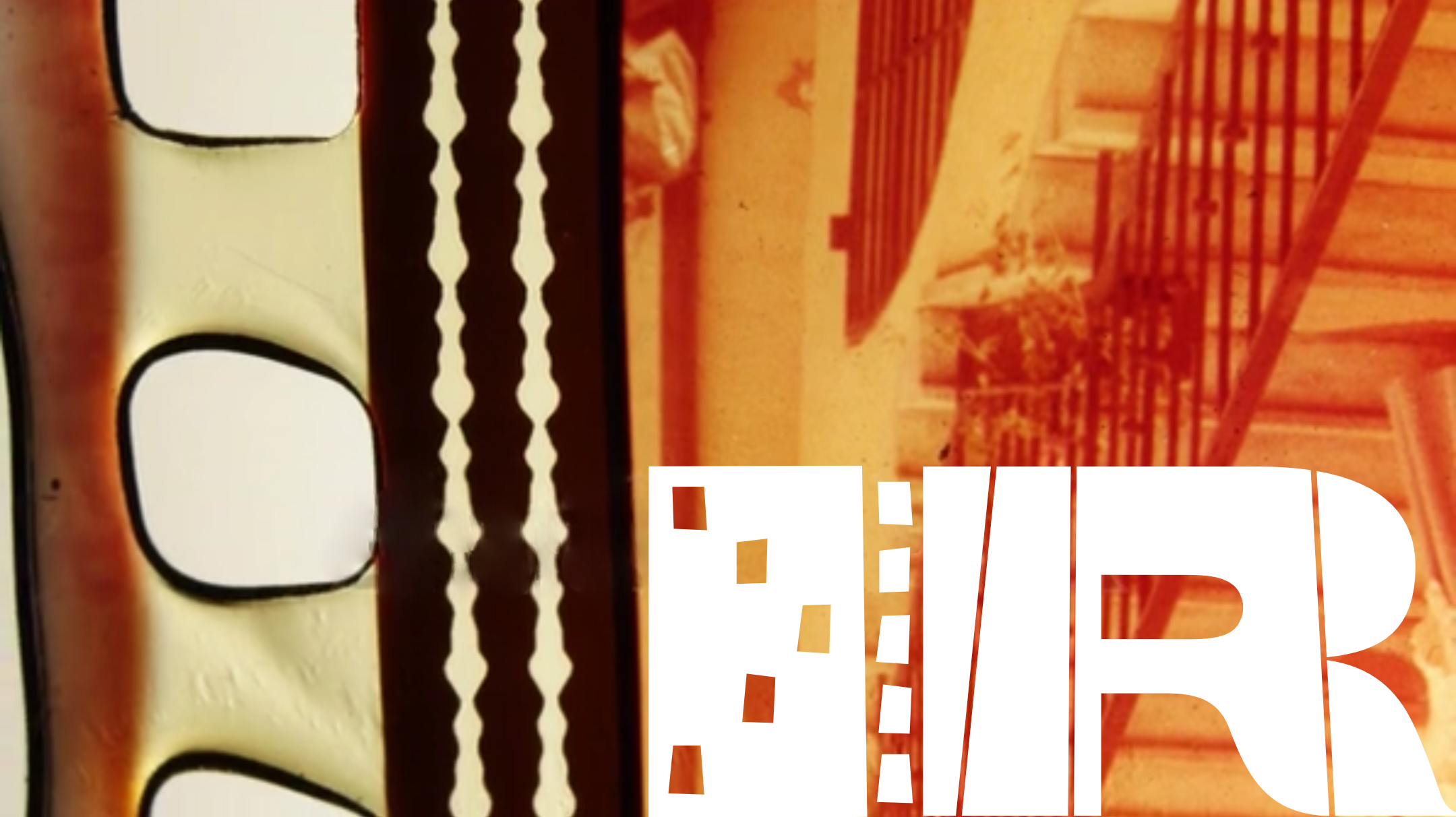
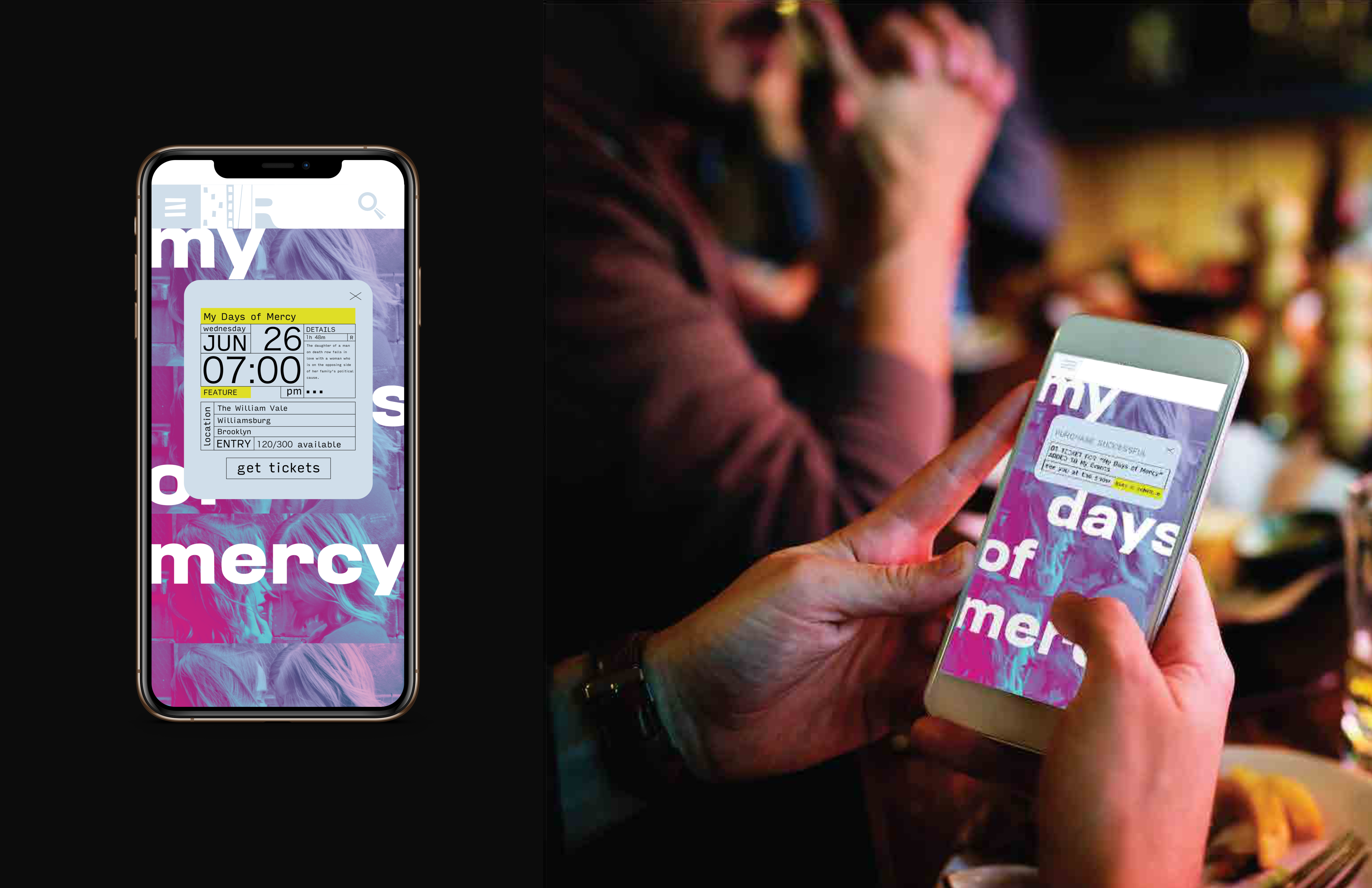
This small project was guided by the grungy city scapes this on-the-go theatrical experience exists in. Rooftop Films provides unique “drive in” sensibilities with the spirit of the city holding screenings wherever films can be projected. They hold events at different locations in large cities across the US, so the idea was to create a unique app experience to inform audiences and make a memorable ticket experience.
Design_
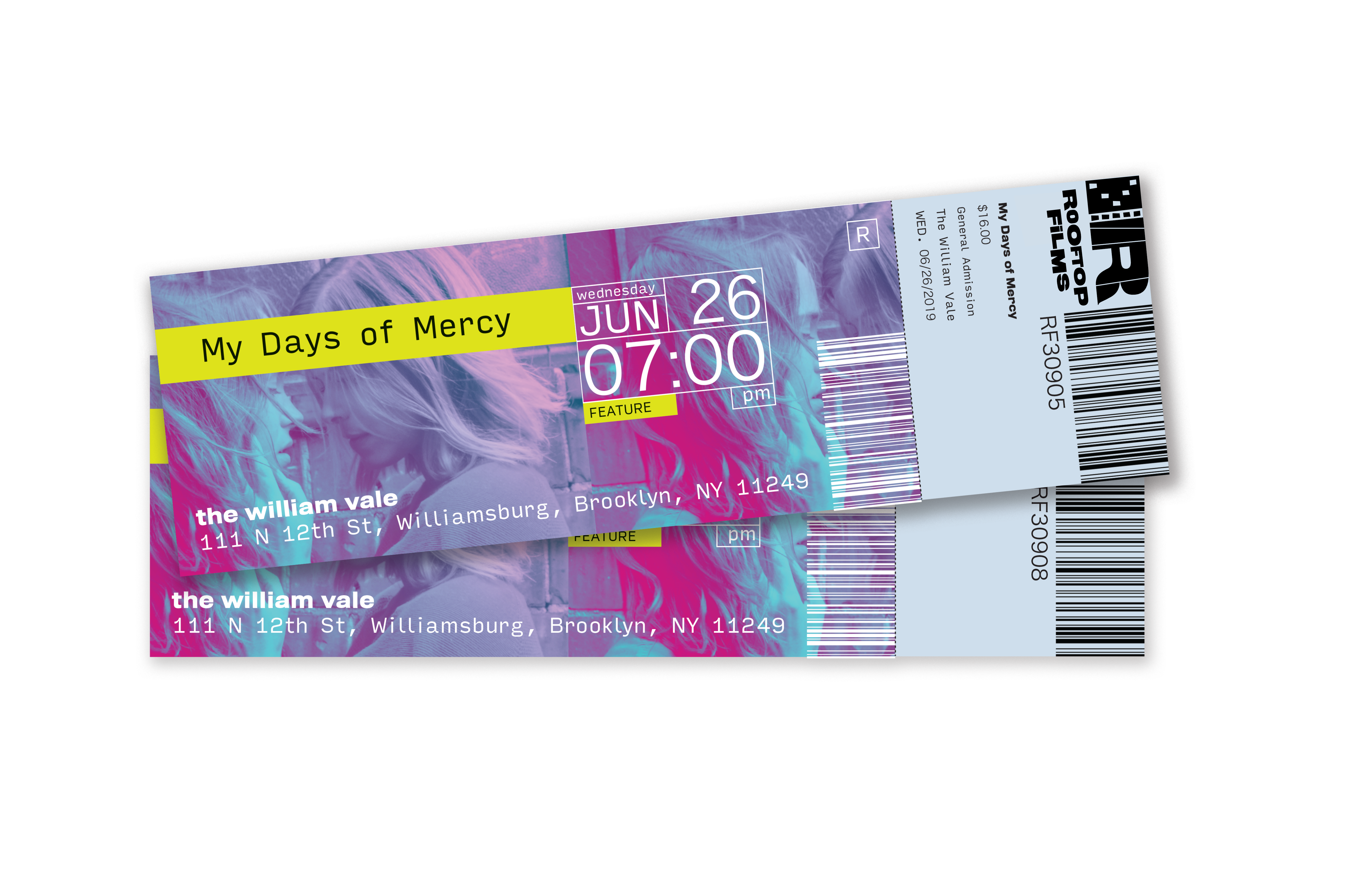
Many miss the experience of collecting tickets and the collectable quality they had. This app ventures to make semi custom ticket landing pages for guests to remember each experience by.
Because there are limited showings by date, time and availability, there is an opportunity to dedicate care in the crafting of these physical and virtual tickets. Both would exist in template format but be able to be customized with unique color and image choices. Each event is individual so the ticket should be too.


